

When producing descriptive stats it’s quite useful to draw some histograms. A nice approach to that are the density plots that you can draw with ggplot2::geom_density. It is also useful to combine that with ggplot2::facet_grid to produce a grid of density plots.
When the data is not too big this is relatively easy to do, but if the data is large the usual process does not work because R can’t cope with that much data in memory.
Here I show a way of pre-aggregating the data so the plots can still be drawn.
I’ll start with an example where R, geom_density and facet_grid can deal with it.
library(dplyr)
library(ggplot2)
library(knitr)
simulator <- function(n) {
  t <- tibble(
    x = c(rnorm(n = n/2, 0, 1), rnorm(n = n, 2, 2), rnorm(n = n, 2, 3)),
    y = as.factor(c(rep("A", n/2), rep("B", n), rep("C", n))),
    z = as.factor(rbinom(n * 2.5, size = 1, prob = 0.5)),
    w = as.factor(sample(1:5, replace = TRUE, prob = rep(0.2, 5), size = n * 2.5))
  )
  return(t)
}

t <- simulator(1e5)
glimpse(t)
## Observations: 250,000
## Variables: 4
## $ x <dbl> 0.34173925, 2.09904014, -0.03973865, 0.45381049, 2.14291862,...
## $ y <fct> A, A, A, A, A, A, A, A, A, A, A, A, A, A, A, A, A, A, A, A, ...
## $ z <fct> 1, 1, 0, 1, 1, 1, 1, 0, 0, 1, 0, 1, 1, 0, 1, 0, 0, 0, 1, 0, ...
## $ w <fct> 4, 4, 2, 5, 2, 1, 4, 5, 4, 2, 1, 5, 3, 1, 4, 2, 5, 5, 2, 4, ...
summary(t)
##        x             y          z          w
##  Min.   :-10.57888   A: 50000   0:124881   1:50406
##  1st Qu.: -0.08537   B:100000   1:125119   2:50048
##  Median :  1.37243   C:100000              3:49551
##  Mean   :  1.60387                         4:50004
##  3rd Qu.:  3.19154                         5:49991
##  Max.   : 14.92003
p <-
  t %>%
    ggplot(aes(x = x, colour = y, fill = y)) +
      geom_density(alpha = 0.2, adjust = 1) +
      xlim(c(-10, 10)) +
      theme_bw() +
      facet_grid(w ~ z,
                 margins = TRUE,
                 as.table = TRUE)
p
and then let’s plot it

Now, if we try to run the same process but with a 25 million records.
t <- simulator(1e7)

t %>%
  ggplot(aes(x = x, colour = y, fill = y)) +
    geom_density(alpha = 0.2, adjust = 1) +
    xlim(c(-10, 10)) +
    theme_bw() +
    facet_grid(w ~ z,
               margins = TRUE,
               as.table = TRUE)
R chokes, and we get a message similar to this:
Error: cannot allocate vector of size 762.9 Mb
A solution to that is to aggregate the data before drawing the plots. Of course, there will be information loss, but that should be ok if the aggregation is done properly.
To make sure that I’m doing it right I started with a simple density plot. No groups.
To get an aggregated set of values I took the mean within each decile.
In this case I used just 10,000 to see that different options capture the differences.
nt <-
  t %>%
    mutate(parts = case_when(
      x < quantile(x, probs = 0.1) ~ 1,
      x < quantile(x, probs = 0.2) ~ 2,
      x < quantile(x, probs = 0.3) ~ 3,
      x < quantile(x, probs = 0.4) ~ 4,
      x < quantile(x, probs = 0.5) ~ 5,
      x < quantile(x, probs = 0.6) ~ 6,
      x < quantile(x, probs = 0.7) ~ 7,
      x < quantile(x, probs = 0.8) ~ 8,
      x < quantile(x, probs = 0.9) ~ 9,
      x <= quantile(x, probs = 1) ~ 10))

agg <-
  nt %>%
    group_by(parts, y) %>%
    summarise(s = mean(x))
agg %>%
  ggplot(aes(x = s)) +
    geom_density(alpha = 0.2,
                 adjust = 1,
                 fill = "red") +
    xlim(c(-2.5, 7.5)) +
    theme_bw()
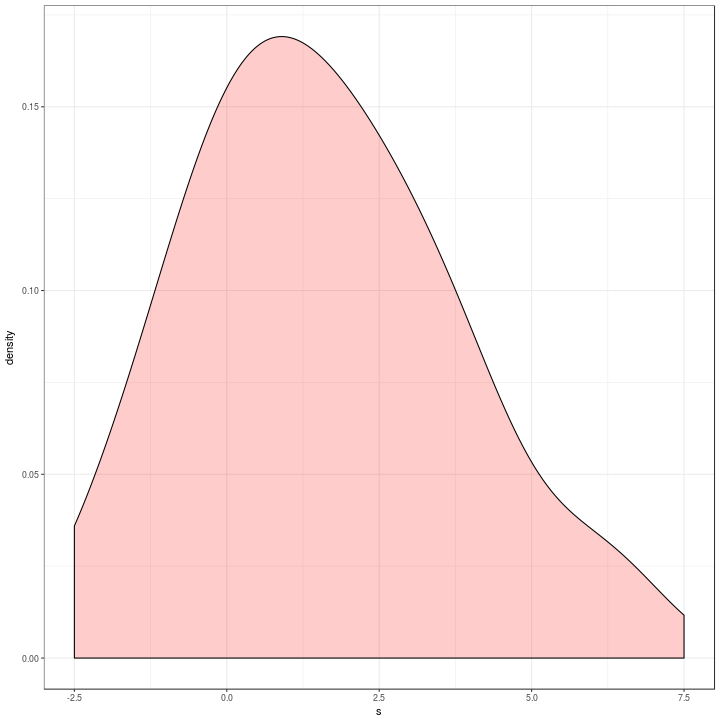
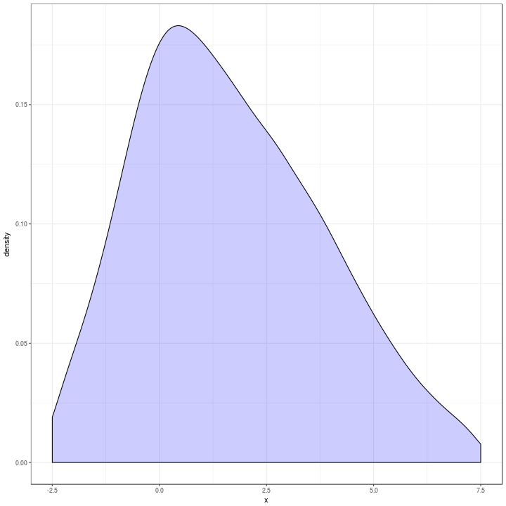
Which is a bit different to the original in blue below.
t %>%
  ggplot(aes(x = x)) +
    geom_density(alpha = 0.2,
                 adjust = 2,
                 fill = "blue") +
    xlim(c(-2.5, 7.5)) +
    theme_bw()
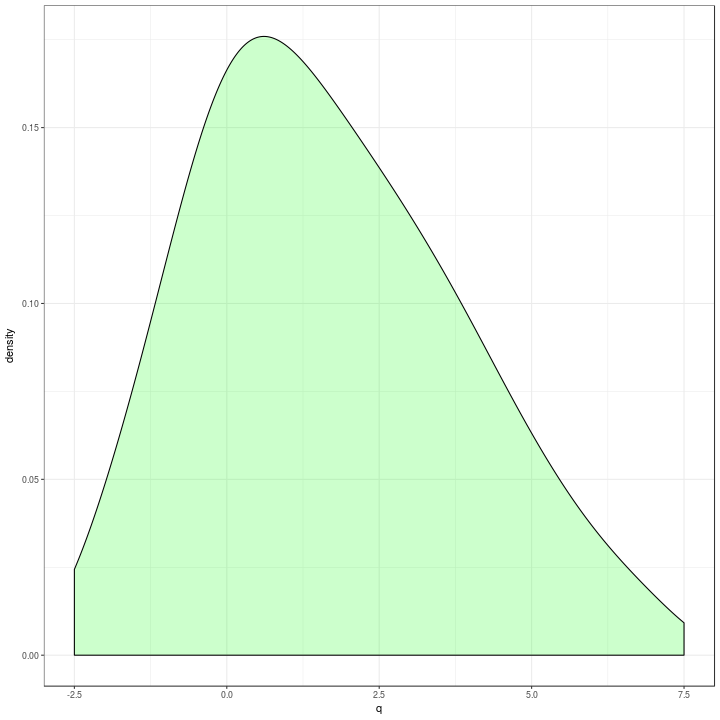
The quantilisation was ugly and difficult to adjust if I wanted more precision which I thought was the case.
I made two changes, first I ignored the need for the mean and took the percentile value. Second I built it in a way that a change in the number of percentiles was easy to adjust.
qx <- tibble(q = quantile(t$x, probs = seq(0, 1, by = 0.0001)))
qx %>%
  ggplot(aes(x = q)) +
    geom_density(alpha = 0.2,
                 adjust = 2,
                 fill = "green") +
    xlim(c(-2.5, 7.5)) +
    theme_bw()
This option was fast enough, so I expanded it to using one grouping variable.
library(tidyr)
library(broom)
library(purrr)

qx <-
  t %>%
    nest(-y) %>%
    mutate(qtls = map(data, ~ quantile(.$x, probs = seq(0, 1, by = 0.0001)))) %>%
    unnest(map(qtls, tidy))

qx %>%
  ggplot(aes(x = x, colour = y, fill = y)) +
    geom_density(alpha = 0.2,
                 adjust = 2) +
    xlim(c(-2.5, 7.5)) +
    theme_bw()
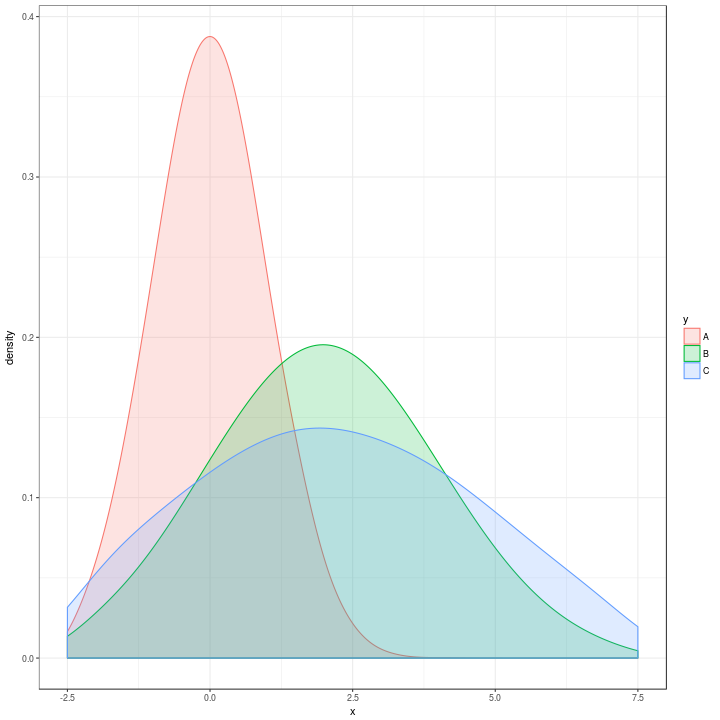
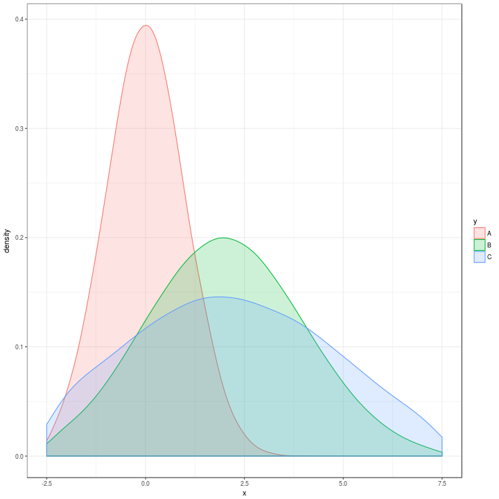
Which looks extremely similar to the original one:
t %>%
  ggplot(aes(x = x, colour = y, fill = y)) +
    geom_density(alpha = 0.2,
                 adjust = 2) +
    xlim(c(-2.5, 7.5)) +
    theme_bw()
And adding in the facet_grid it still runs fast and the plots look very very similar to what they would look like using the original data.
qx <-
  t %>%
    nest(-y,
         -w,
         -z) %>%
    mutate(Quantiles = map(data, ~ quantile(.$x, probs = seq(0, 1, by = 0.0001)))) %>%
    unnest(map(Quantiles, tidy))

qx %>%
  ggplot(aes(x = x, colour = y, fill = y)) +
    geom_density(alpha = 0.2, adjust = 1) +
    xlim(c(-10, 10)) +
    theme_bw() +
    facet_grid(w ~ z,
               margins = TRUE)
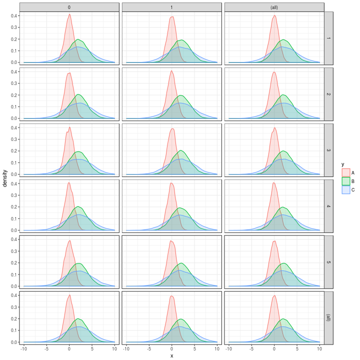
And the original was
p
As always stackoverflow crowd provided 90% of the solution.